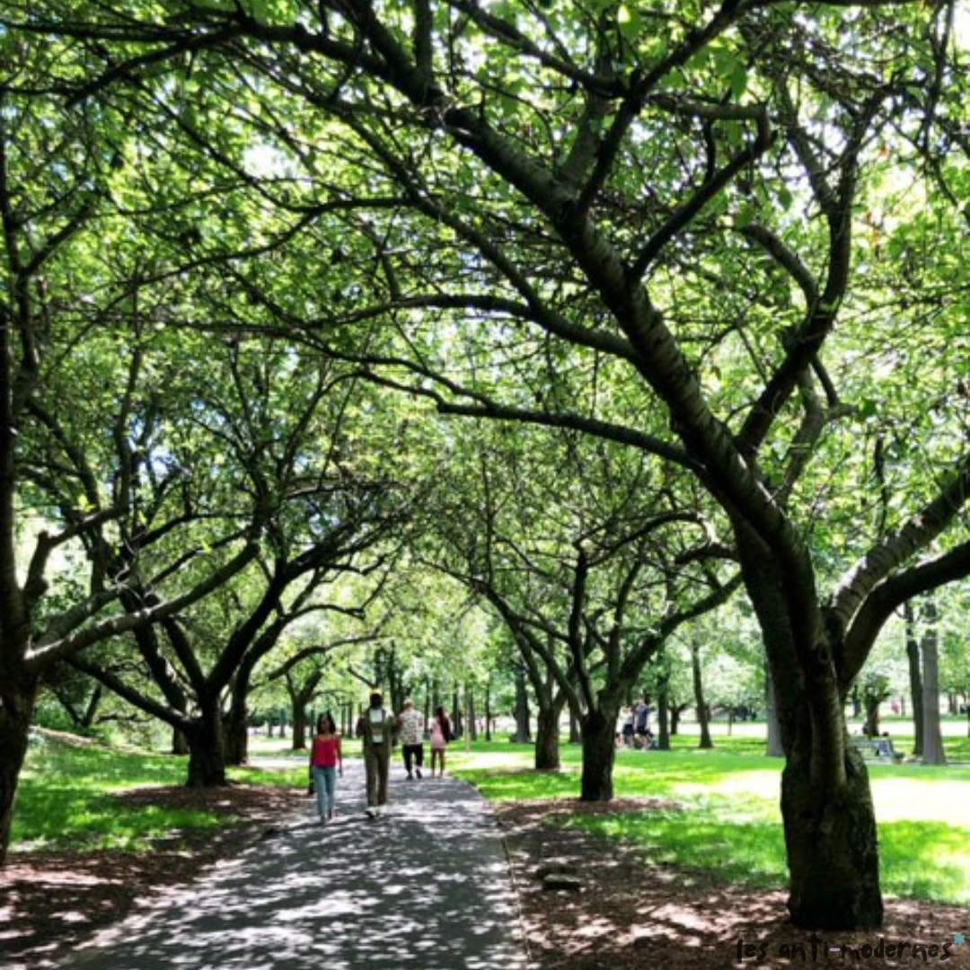
These days, I’m aiming for more strolling, less scrolling. Taking in the sensory delights of the Brooklyn Botanic Garden in early June definitely ranks near the top of the joyful B-list. Is there a more impressive creative director than Mother Nature (and a team of master gardeners)? Meandering through gardens in full bloom is a gift we should all give ourselves more often. The roses stole the show, but I also loved reading all the plant labels referencing plays and sonnets (botanic footnotes — brilliant!) in the tucked away, cottage-y Shakespeare Garden. And after getting drunk on roses all day, I emerged feeling much more relaxed and clearheaded … a testament to how green spaces can so positively impact our mood and sense of wellbeing.1 There were many dazzling color combinations throughout the grounds, but the most striking one was pink and green. Very inspired to bring this color palette into more of my summer outfits.

This got me thinking about how easily we can get into a color (or in my case, a neutrals-only) rut. We probably all have go-to color combos that define our comfort zone, but now and then it’s good to branch out and explore new colorways. No need to be intimidated. Here’s an easy way to make use of some of your phone pics to experiment with novel color stories. (Don’t we all hoard so many beautiful photos in the obscure depths of our phone?) Instead of relying on IG or Pinterest, why not use the images from our own travels/weekends/daily life as inspiration?
A Color Matching/Moodboard Exercise:
Pick one of your favorite nature/scenery photos and map out a color palette.
Survey what you have in your closet in those color families (chances are, you have something in one or a few of the colors that corresponds to what you’re naturally drawn to in the wild!).
Play with color pairings and save the ones you like as an easy reference for outfit planning, accessorizing for special occasions, and interior decor inspiration. (My general color coordination rule is, if it exists in nature already, it’s aesthetically legit.)
When I did this exercise, I was pleasantly surprised by how many wardrobe pieces I already have that map to this very color palette. Pairing existing pieces together in new ways is a revelation: many of these colors — army green, lilac-y mauve, espresso brown, peony pink — seem very oppositional, but actually play quite well with each other.

Artists and designers have been looking to the natural world for inspiration for so long, nature really is the original influencer, no?2 I think that just taking some time to explore our natural surroundings awakens a bit of the artist and designer in all of us. Being out in the world engages all our senses. Without the distraction of screens, we can pause, slow down, and pay attention to the details that draw us in. This is probably why people watching at the park is always more fun than pinning algorithm-fed outfit pics online. A lot of this often begins with a leisurely walk, when we give ourselves the latitude to wander with curiosity and without a predetermined destination.
///
I encourage you to try this and have fun with the process! What are your favorite old or new color combos?
For more, see Gretchen Reynolds’ piece on the neurological effects of a walk in the park.
As seen in the 2018-2019 V&A exhibit, Fashioned from Nature.


I LOVE this! I once read somewhere that if you don't know what to wear with a certain color think about how you see it in nature (i.e. red with green and brown like on an apple).
Yes to all of this! I'm always intrigued by the color combinations I see in birds. Even a single feather can have so many different shades of the same color, or in some cases, drastically different or contrasting ones.